Using squiggly styled fonts to assist with wireframing
Introduction
If you’ve been involved with the design and implementation from other peoples designs of as many sites as I have you’ve no doubt come across or used the good old “lorem ipsum” holder text.
Example
Lorem ipsum
Ex mentitum consulatu voluptaria mea, eu pro esse labitur. Quod urbanitas contentiones sed ne, cibo appetere menandri vim ea. Duo in sumo phaedrum percipitur, ut omnis prima cum. No usu dicant mandamus definitionem, per altera feugiat hendrerit an. Vix no dolorem intellegam, id melius impetus mea, feugiat neglegentur necessitatis ius ea.
Unfortunately, this has on occasion caused confusion…
The issues with using Latin placeholder text
Not everyone understands that the text in question is there as a ‘test’ placeholder, which leads to questions like “why is all the text in Latin?” 🤦♂️
We as developers need at times to remember that clients / users are not always accustomed to standards that we use and easily get frustrated when they don’t understand something.
Using text as a ‘graphic’
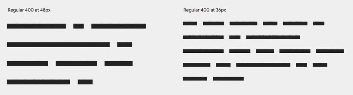
One solution is to bypass using recognisable text at all by making use of what I’m referring to as “squiggly styled fonts.”
The examples below show two different styles; squiggle and block.

Links to free fonts
- Redacted Script (
Google Fonts) - Flow Block (
Google Fonts) - Fillr Font (
PowerMockup)
Putting it to work…
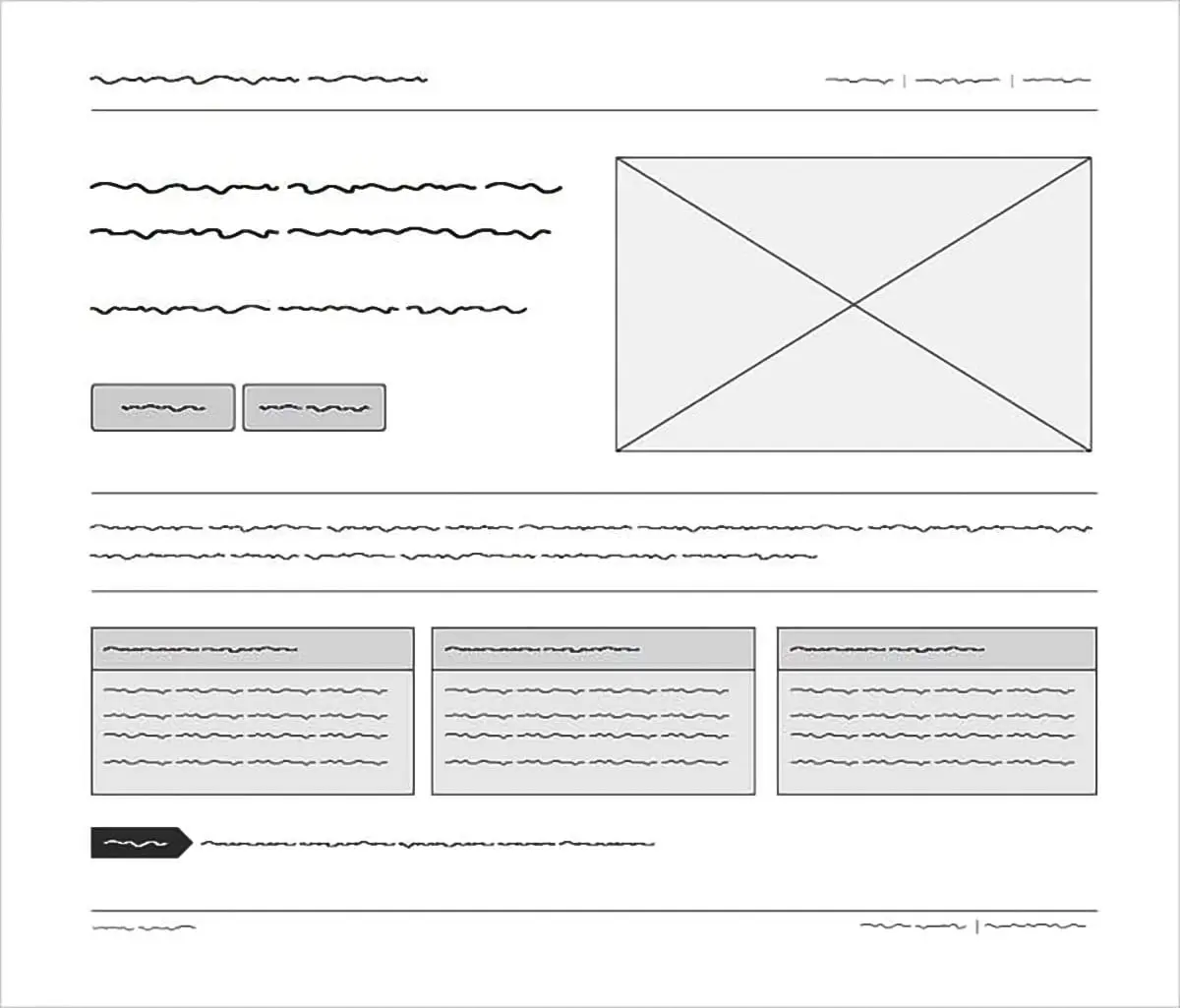
The graphic below (copied from powermockup.com – creators of the Fillr font) nicely demonstrates what we’re trying to achieve here in terms of a wireframed mockup without confusing text.
Try it out…
Click the Switch Font button to see the transformation from this sites standard Inter font to the Redacted Script from Google.
Lorem ipsum
Ex mentitum consulatu voluptaria mea, eu pro esse labitur. Quod urbanitas contentiones sed ne, cibo appetere menandri vim ea. Duo in sumo phaedrum percipitur, ut omnis prima cum. No usu dicant mandamus definitionem, per altera feugiat hendrerit an. Vix no dolorem intellegam, id melius impetus mea, feugiat neglegentur necessitatis ius ea.
That’s all folks
If you haven’t guessed already, I set out to create that little Font Switch as the fun part right from the get-go. It uses Local Storage to retain state so you can reload the page and the changes will persist.
Both sections highlighted with a yellow border will change so remember to scroll up if you haven’t yet done so.
// End of Project
More Information
Further Reading
- Lorem Ipsum Background Info (wikipedia.org)
- Redacted Script (fonts.google.com)
- Flow Block (fonts.google.com)
- Fillr Font (powermockup.com)
About Dave A.K.A. 'barrd'